Who doesn’t like touring a cool house? Check out these fabulous images of a beautiful eclectic home in London photographed by 1st Option agency. Aside from the lovely job they did photographing this delightful space, its pretty clear that this is not your typical cookie cutter home! The family has personalized every space with a different vibe and color concept of it’s own. Follow us while we walk through…
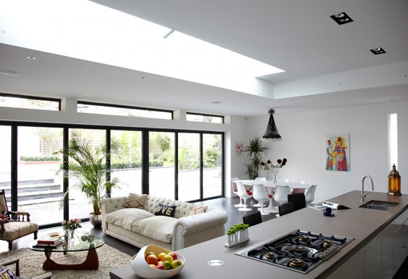
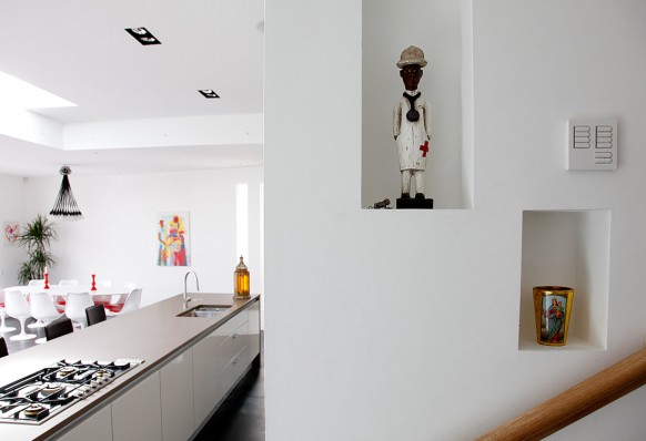
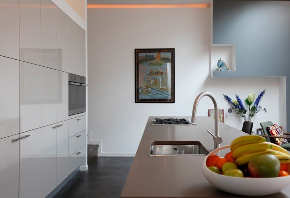
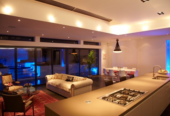
This open space plan which blends kitchen, living and dining space keeps all these areas separate but seamlessly situated. It’s important to respect every function in a large open space for what it is and allow it to make it’s own statement.
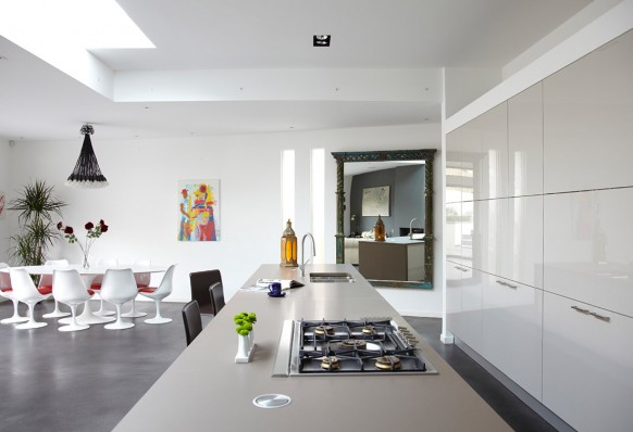
The light gray counter top and cabinets subtly introduce significance to the space while letting your eye lead you through the whole space at a pleasing pace.
Also, by hanging a huge antique mirror on the far wall, they created a focal point in a bare corner for unexpected charm and color by reflecting the accent wall which ties the room together nicely.
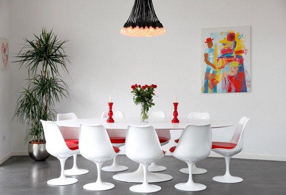
This exciting dining space is rich with pops of vibrant color and and an unusual chandelier resembling ceiling strung light bulbs. Definitely a conversation starter, which is a nice element in a dining space!
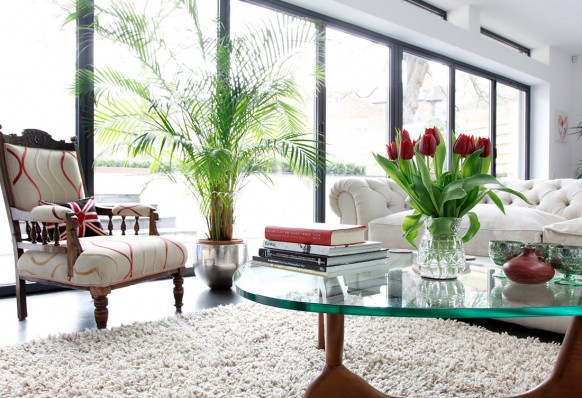
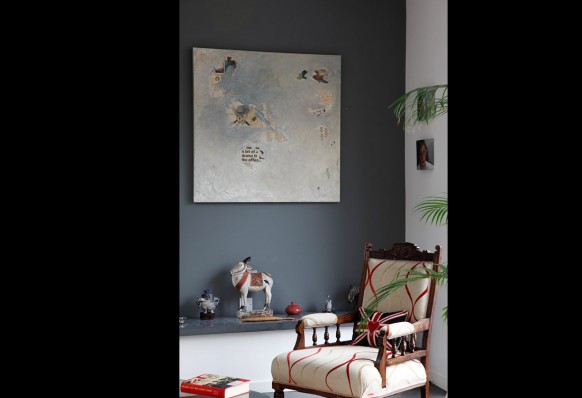
The living room keeps the same color scheme but has a more calming air about it than the dining area while possessing the same playful sophistication. They tied the spaces together with red-toned elements in the art, fabric, fresh flowers and practical objects which make it feel lived in and personalized!
The white walls serve the wonderful purpose of allowing the objects displayed to do the story-telling. Things collected from travels and sparingly planted around the house will add charm to your home and invite trips down memory lane…
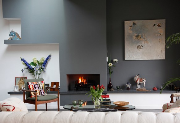
This blue slate accent color does wonders for the fireplace wall, which is naturally a focal point and harmoniously coordinates with the other gray and red accents in the room.
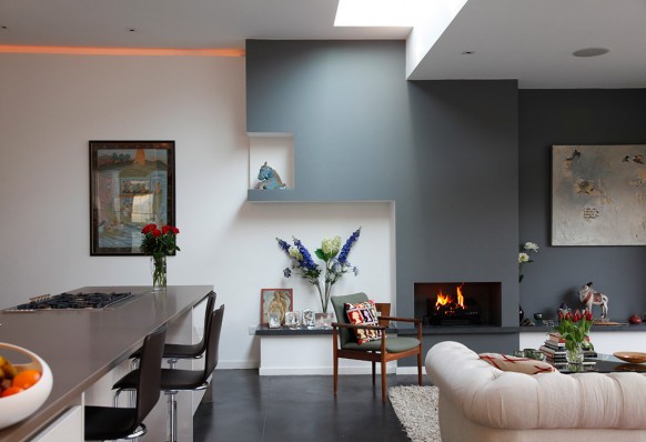
The build-in niches in the wall add dimension to the architecture and by painting them white, slowly breaks your eye away from the accent wall and leads you back to the default wall color.
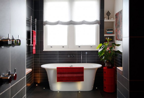
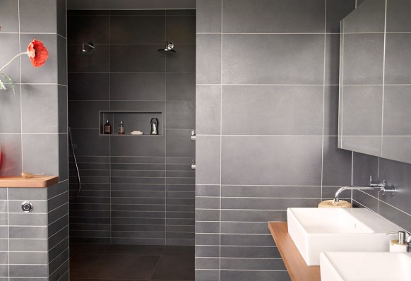
This modern bathroom had a lot of character because the red accessories pop against the dark sophisticated gray tile and a more traditional scalloped roman shade adds a nice contrast to this otherwise linear space.
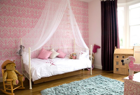
Although this is clearly a little girl’s room, the pink jacquard wallpaper print makes it transitional for a more grown up but fun look when she’s ready for the next phase of her life.


No comments:
Post a Comment